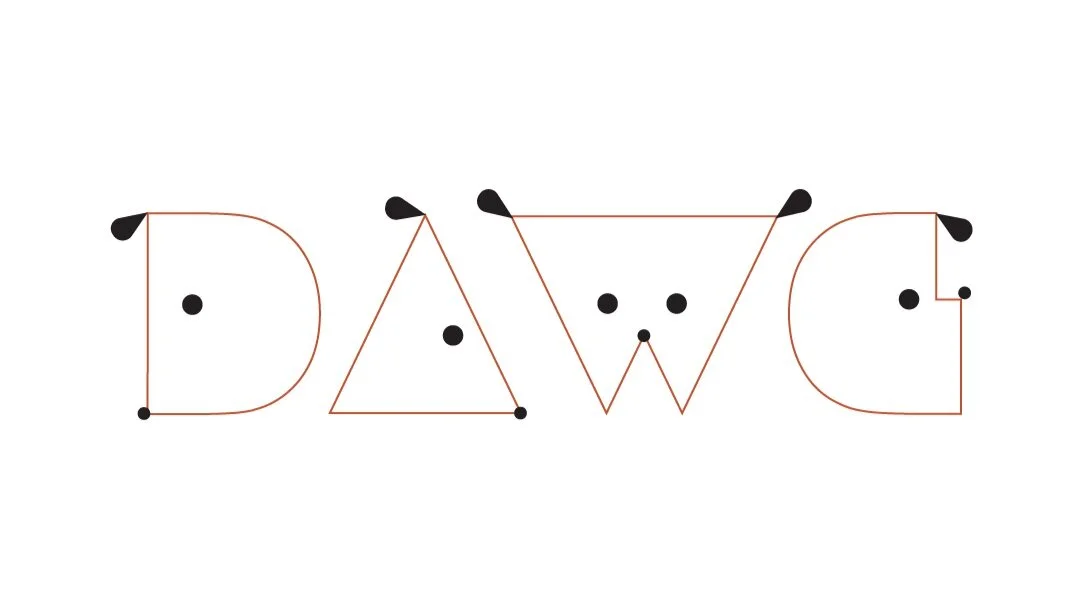
DAWG
THE ASK:
DAWG is a Brooklyn Alliance promoting the off-leash needs of dogs within North Brooklyn parks. The alliance needed a name, a brand design, a website and a landing page to achieve their goals of gaining community members and presenting their mission to Local representatives.
THE PROCESS:
The first challenge was to create the name. Chana conceived the name ‘DAWG’. She proposed it as the simplest and most obvious choice, the acronym standing for “Dog Alliance of Williamsburg and Greenpoint”. It was to the point and had the flair of the neighborhood, invoking a youthful culture of creative camaraderie.
Next up was the visual brand - the logo. North Brooklyn is a diverse neighborhood with residents of all age groups, varying cultures and lifestyles. A simple, artistic and sweet logo expressing progressive pet ownership was in order. The logo needed to be professional enough for local officials but progressive enough to attract young creatives.
To hit all the marks Chana designed many variations. Some designs strongly reflected the street and pop art seen on the sides of the local neighborhood buildings. Others appealed more to the families with dogs and young creatives. In the end the hairline geometrical logo was chosen for its simple, professional, and artistic esthetic. Its simplicity was professional, its geometry was artistic, the dog’s faces were diverse and friendly: it hit all the needed targets. The next steps would be to implement the brand image into a digital space.
THE OUTCOME:
The large geographic lettering of the logo lent itself to a clean and broad visual style for the website. The logo shapes were used to draw attention to the negative spaces, playing with dropping the outline around the text to extract the letters as shapes. The letters could become the basis for brand imagery. A play on hairline and bold text mirroring the logo’s outline and broad letter surfaces.
In the same style as the logo. broad and stretched photography was used depicting friendly, well trained dogs running off-leash in parks. Leaving large spaces between elements and around the logo, and choosing playful, geometric imagery became a brand direction. The brand colors of rust, black, tan, bright yellow-green and white reflected the bold and playful colors of dogs and parks.


