RAEWEAR
THE ASK:
Raewear is a new swimwear brand based out of California. The founder Needed a name and logo for her new company. Planning for the longevity of her brand Raewear needed to be recognizable and to hold its own in the competitive world of fashion.
THE PROCESS:
A quick 2 month deadline was given to create both the name and the logo. The owner wanted to include her name in the brand. We decided on using her middle name Rae. Her sights went beyond swimwear with the intension of adding sports wear to her fashion line as the brand grew. The word ‘wear’ was open ended and could encompass a variety of fashion products. The simplicity and personal attributes to the name Raewear was a winning combination. The next step would be the logo. The budget and timing was very tight and I offered a logo that was primarily built from a single font to speed things along. This was also relevant considering most high end fashion brands mainly consisted of only letters, for example DKNY, marc jacobs, and Supreme etc.
THE OUTCOME:
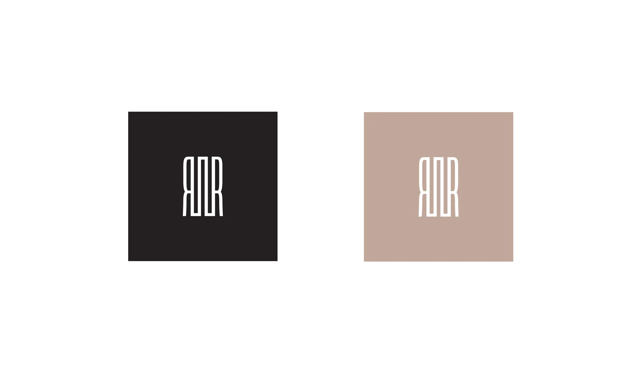
With the advantage of the name being a palindrome we utilized the symmetry of the letters to create a very symbolic looking name and font based logo. The “W” was redesigned to be more symmetrical and used as the central element of the name. The final “R” was turned to the left and letters were also stretched to achieve a particularly symmetrical, hi-fashion aesthetic. Then we needed a symbol that could be used for the tag and other small elements like the back hook of the bikini on the bathing suit for example. The colors chosen where to reflect the color of skin as well as invoke a painterly approach. Taglines were created like “You are the art, Rae is the frame”


